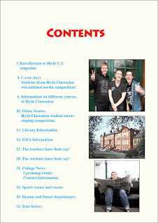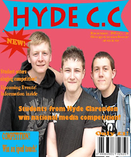

Here is my front cover for my college magazine and the contents page for it too. I only had roughly two weeks to complete both the pages, therefore there are some things on the magazine cover and contents page that could be improved. However there are some aspects of the magazine I feel have been done well.
I have related the main story which is 'Students from Hyde Clarendon win national media competition' with the image on the front cover. The image is of three of my friend who attend the same college who were willing to help me. They allowed me to take a picture of them for the front cover, however, I had to take a few pictures of them and then once I felt that I had enough I looked through them all and chose which I thought was the best. I kept the picture fairly simple as it is just the three of them standing together but they look happy and it was to show the audience properly that these people used have some link to the main story.
One disadvantage to my magazine is the use of quite a few colours. I used light colours so that the magazine seemed lighter and attractive and not dull. I used the colour red as the title as I thought it stood out more and would attract people to it. I kept the other colours different from red as I wanted the title to stand out. I made sure I included the barcode, price and date as this is what is on all magazines. I also made sure that I included some sign that mentions that the magazine is a new addition. The issue number that is included on the cover shows that it is the first issue too.
I included other features of the magazine at the side on the cover. I put them on the side because if they are not the main story than they usually go with other features on the side of real magazines. I included competition as well and mentioned that on the front cover. That was too attract students as well as they may want to take part, I even mentioned what you can win in the competition on the front cover as that may make more people become interested and want to take part in it as they know what they can win. I added a blue box behind the competition sign as it made it more bolder to the audience. Just like I added a star shape behind the 'New!' sign to make it stand out more. I put the star shape on by using the custom shape tool. I added a box onto it by using the rectangle tool. I see these as advantages to my magazine as they are a strong point in what I have done.
No comments:
Post a Comment