Thursday, 30 September 2010
Tuesday, 28 September 2010
Research and Planning: Preliminary Task


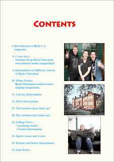
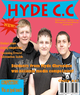
Here is my front cover for my college magazine and the contents page for it too. I only had roughly two weeks to complete both the pages, therefore there are some things on the magazine cover and contents page that could be improved. However there are some aspects of the magazine I feel have been done well.
I have related the main story which is 'Students from Hyde Clarendon win national media competition' with the image on the front cover. The image is of three of my friend who attend the same college who were willing to help me. They allowed me to take a picture of them for the front cover, however, I had to take a few pictures of them and then once I felt that I had enough I looked through them all and chose which I thought was the best. I kept the picture fairly simple as it is just the three of them standing together but they look happy and it was to show the audience properly that these people used have some link to the main story.
One disadvantage to my magazine is the use of quite a few colours. I used light colours so that the magazine seemed lighter and attractive and not dull. I used the colour red as the title as I thought it stood out more and would attract people to it. I kept the other colours different from red as I wanted the title to stand out. I made sure I included the barcode, price and date as this is what is on all magazines. I also made sure that I included some sign that mentions that the magazine is a new addition. The issue number that is included on the cover shows that it is the first issue too.
I included other features of the magazine at the side on the cover. I put them on the side because if they are not the main story than they usually go with other features on the side of real magazines. I included competition as well and mentioned that on the front cover. That was too attract students as well as they may want to take part, I even mentioned what you can win in the competition on the front cover as that may make more people become interested and want to take part in it as they know what they can win. I added a blue box behind the competition sign as it made it more bolder to the audience. Just like I added a star shape behind the 'New!' sign to make it stand out more. I put the star shape on by using the custom shape tool. I added a box onto it by using the rectangle tool. I see these as advantages to my magazine as they are a strong point in what I have done.
Monday, 20 September 2010
Research and Planning: Research into Imaginary Fonts
Here are my examples of different mastheads for different imaginary magazines.
I did one for a metal magazine named 'Death Metal', one for a pop magazine named 'Popworld' and one for a film magazine Called 'Popcorn'. I got these fonts off Photoshop and looked at different ones to decide which I thought would suit the type of music for the magazine.
For 'Death Metal' I used black font as I thought it would be appropriate for the style if metal which is usually associated with dark colours. I chose the font 'A Trip to Hell and Back' as I thought it was suitable for the Metal magazine and it was a sharp font that stands out and looks slightly jagged.
For 'Popworld' I used purple font as it was a lighter colour and it is more of a colour associated with pop magazines. The font I used was to make it look more like a pop magazine as the words are more rounded and softer yet they still stand out.
For 'Popcorn' magazine I used yellow font as the colour yellow is associated with popcorn. The font was used to give it a pop feeling as it looks a bit like bubble writing. This font also stands out to the readers so it will make them more interested in what the magazine is about.
Research and Planning: Research of Semiotics
Semiotics or semiology, is the study of signs and meanings. It originally comes from the greek word 'semeion' which means sign. A sign is any physical object with a meaning. It comes in useful in particular areas such as media studies when it comes to the analysis of print and film.
There are three areas of study when it comes to semiotics.
These are :
- The sign - the picture, object, sound.
- The system into which signs are organised.
- The culture within which these signs operate.
This magazine cover here has the use of Semiotics as everything shown on this cover has some sort of sign and meaning. The main picture on this 'Vibe' magazine shows rapper Eminem, so straight away this shows that this magazine is about rap music so it will interest people who like rap music.
The face that Eminem is wearing a crucifix shows a more religious element and to show belief as this could be a symbol as something to do with Eminem as a person and showing off who this person is on the magazine cover. Eminem is also wearing a plain black vest top but this could be to emphasise his bare arms which show his tattoos. Tattoos like his are usually associated with other rap artists as it is a style that most of them go for. So once again, readers know that straight away it is a rap music magazine.
The colours are kept fairly simple by having white as the background. This would be to show off Eminem's image more. Then there is the use of the colour black to contrast with the white background as the fonts are mainly black but also so have another simpler colour too. However, the red masthead and the red font for the main story gives the magazine more colour and makes it sharper and makes the masthead and the main story stand out more from the rest of the magazine so this attracts the reader and also gives it more of a rap magazine style. Research and Planning: Draft of my College Magazine
Here is my first draft design of my college magazine.
I made sure that I included the masthead, barcode, price and issue number that all magazines have. I also made sure that I had shown where my main picture is going to be and I have made a note as to what the main picure may be.
Thursday, 16 September 2010
Research and Planning: Target Audience for College Magazine
The target audience for my college magazine is going to be mainly 15-20 as this is the age that most people are at college and it will be able to relate to them more, interest and attract people attending the college.
My college magazine will be suitable for both male and female gender types. This is because both males and females attend the college so therefore it will be available and suitable for both. If my magazine is for both genders then it will have a wider target audience. it will also have a wider target audience due to the age too.
My college magazine is going to interest most of the people attending the college. It will contain information on the different courses that are available to do at the college such as Media, Film Studies and many more. It will also contain stories that could relate to college students and attract them. It will also interest students who want to know more about what is going on at the college such as enrichment and other news about what is going to be happening.
The magazine will be aimed at people who are currently studying GCSE's and are thinking of attending the college and want to know about it and what it is like. It will also be aimed at students who are already attending college and want to know about other courses or their own course and what is happening or any news about the college. So A level students as well as A2 students will be interested by it as well as Btec students and other students taking vocational courses.
When it comes to class, it will be available to all classes of people. So that could be working class, upper classes and middle classes. Whoever attends the college will be the target audience for the magazine. It will mainly be for working class and middle class though as most of this type of class students will be at the college and it may attract and interest them more to read it.
Research and Planning: Medium Close Up Examples
Here are some examples of medium close up pictures for my research and planning. Medium close up shots only show the head and a little bit more down the body but they are not full length. Usually pictures or film shots may be like this as it emphasises facial expressions and it takes the focus away from the rest of the body. It also helps to clearly see who the person is. Magzines use medium close up's of people on the front covers as it is easier to tell who the person is plus make-up and facial expressions are easier to see.
Research and Planning: Analysis of a College Magazine
Here is an example of a college magazine. I uploaded this image from google so that I could analyse it for my research and planning.
The title if the magazine shows it is a college magazine as it is called College but also the type of font used for magazine gives it an american preppy style college look.
The image of the person used on the front cover of this magazine also shows that it is a college magazine as the person looks the age of college students and it would appeal to the target audience of this magazine. The image us
The use of the stories shown on the cover is aimed at the target audience of college students as some stories could relate to certain people or just be an interesting read for them. The use of the colours and font used is bright yet dark at the same time for a contrasting colour to attract the audience.
The barcode is on show as it usually is on all magazine front covers.
Research and Planning: Introduction to Photoshop (Creating a Document)
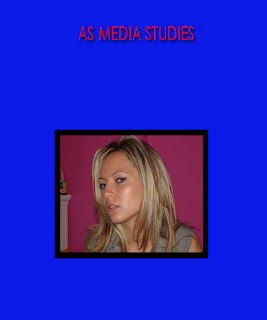
Here in my media studies lesson I had to go onto photoshop and change the background colour to blue. To do this i had to pick the colour from the colour panel and find the blue to select it. I then had to go onto the paint bucket tool and click on the background and then the colour would automatically change to the selected colour.
Then I had to add some text to the photoshop document. i had to type 'AS Media Studies' and change the colour to red. To change the colour i had to highlight the text and then click on the colour box. Then I had to drop shadow my text by firstly clicking on the correct layer that the text belongs to and then going onto Layer and the Layer Style which then took me onto drop shadow.
Next, I had to place my skin tutorial picture onto the document by making sure I had saved the picture as a JPeg. Then I went onto file and then Place to chose the correct picture, double click and load it on.
Finally, I had to draw a rectangle onto the document by clicking on the Rectangle Tool and drawing out my box over the top of my picture, making sure that it is slightly bigger than the picture. Then the rectangle would go over the top of the picture so then I had to click on the layers palette on the one which had the layer for the rectangle and drag the layer over the top of the layer to that skin tutorial picture. I also selected the Paint Bucket Tool to change the colour of the rectangle to black.

Research and Planning: Film Review
Here I went onto the Empire website and looked for a film review. I chose the film review for 'The Last Song' which is a romance film. I had to copy and paste the review from Empire and go onto In Design to make columns onto my document and then paste the review onto my document but make sure that if need be that the review was dragged over to other colums, however, mine did not need that to happen as the review was quite short so the review managed to stay in one column. I then got to change the background colour as well as adding a title to the top of it and changing the font colour. I then got to look for a film poster on the internet and save it to place onto the In Design document and place int0 the other column to finish off my film review. This could be improved as the picture could have been moved more away from the text as there is still plenty of space to fill. I could have also chosen a better colour for the text as it is hard to read it due to the colour of the background which is a similar colour.
Monday, 13 September 2010
Research and Planning: Skin Correction Tutorial
Research and Planning: Introduction to Photoshop
This was what I produced in my first media lesson. It's a CD cover which I made and edited. Baring in mind that this was the first time that I used Photoshop.
I learnt how to change the colour of pictures and how to put pictures on a new background. I also learnt how to apply text onto the picture and how to change the colour, font size and type of font. I learnt how to distort a background too.
I learnt how to change the colour of pictures and how to put pictures on a new background. I also learnt how to apply text onto the picture and how to change the colour, font size and type of font. I learnt how to distort a background too.
Subscribe to:
Comments (Atom)


